Imagine your product sitting on a shelf surrounded by ten competitors.
Similar size.
Similar price.
Similar promise.
Why does the customer reach for yours?
Before they read the ingredients, scan the QR code or discover how good the product is, something else has already happened:
Your packaging has either earned their attention or lost it.
A label isn’t simply somewhere to put a logo and mandatory information. It is one of the hardest-working pieces of marketing your product owns.
And sometimes, the difference between ordinary and premium isn’t the product inside.
It’s the way the product presents itself outside.
What Makes a Product Label Stand Out?
Effective label design combines visual impact, clear communication and the right materials and finishes.
Here are some of the elements that can influence how a product is perceived:
1. Colour Creates the First Impression
Colour can make a product feel premium, natural, energetic, traditional, clinical, playful or sophisticated before a customer reads a single word.
But standing out doesn’t always mean becoming louder.
In a category filled with bright packaging, restraint may attract attention. In a minimalist category, one confident colour might become your greatest differentiator.
The question isn’t “Which colour looks good?”
It’s: “Which colour says the right thing about this product?”
2. Typography Creates Personality
Typography can subtly change the entire perception of a brand.
Compare a delicate serif typeface with bold modern lettering. One might communicate heritage and craftsmanship; another might suggest innovation and confidence.
Good typography also creates hierarchy.
Your customer should quickly understand:
What is it? Who makes it? Why should I care?
If everything on the label is shouting, nothing gets heard.
3. Touch Can Change Perceived Value
Consumers don’t only see packaging. They pick it up.
The material, texture and finish of a label can influence how premium a product feels in the hand.
Depending on the application, carefully selected finishes can introduce contrast, texture, shine or subtle detail that turns a relatively simple design into something memorable.
Premium packaging doesn’t necessarily need more design.
Sometimes it needs better production choices.
4. Shape Can Become Part of Your Brand
Rectangular labels are practical, but they aren’t the only option.
A distinctive shape, considered die-cut or creative interaction with the container itself can give packaging an identity before the customer has even processed the branding.
The label and container should work together.
Don’t design a label in isolation. Design the product customers will actually see.
5. Your Product Range Should Look Like a Family
One successful product often becomes two. Then five. Then fifteen.
Flavours, fragrances, sizes and variations need enough differentiation to help customers choose, while retaining enough consistency to remain unmistakably part of the same brand.
Colour systems, typography, layout and recurring design elements can create that connection.
From several metres away, customers should be able to recognise your brand before they recognise the individual variant.
6. More Information Doesn’t Always Mean Better Communication
Labels often have a lot of work to do.
Ingredients. Directions. Warnings. Barcodes. Regulatory information. Product benefits. Certifications. Contact information. QR codes.
The temptation is to squeeze everything onto the front.
But your front label has another job:
It has to make someone want to pick the product up.
Good packaging creates a hierarchy between what the consumer needs to see immediately and what they can discover once they engage with the product.
Where space is limited, solutions such as multilayer and peel-and-read labels can provide additional room without overwhelming the primary design.
Ordinary → Premium: What Actually Changed?
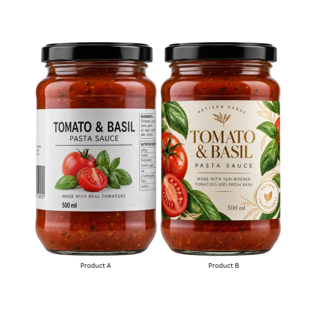
Imagine two identical bottles containing exactly the same product.
Bottle A: Standard material, crowded information, several competing typefaces and no clear visual hierarchy.
Bottle B: Carefully considered label material, confident typography, controlled use of colour, clear information hierarchy and a finish selected to complement the brand.
The product hasn’t changed.
The bottle hasn’t changed.
But the customer’s perception of its value may have changed completely.
That is the power of a well-considered label.
Your Label Isn’t Decoration. It’s a Decision-Making Tool.
There is no single formula for creating packaging that gets noticed.
Sometimes bold wins.
Sometimes simplicity wins.
Sometimes colour does the work.
Sometimes texture does.
The important question is whether every element of your label is helping communicate who you are, what you’re selling and why your product deserves attention.
At Rebsons, we’ve spent more than 60 years helping businesses turn ideas into labels and packaging that need to perform in the real world.
We understand the technical side of label production — but we also understand that when your product reaches the shelf, your label has a much bigger job to do than simply stick to the container.
Before Your Next Print Run, Take Another Look at Your Label.
Does it still represent the quality of the product inside?
Does it stand confidently beside its competitors?
And, most importantly:
If you had three seconds to choose, would you notice it?
Planning a new label or considering refreshing your existing packaging?
Send your current packaging to Rebsons for a label review. Let’s look at what is working, what could work harder and what production possibilities could help your product make a stronger first impression.
Send an email to: sales@rebsons.co.za