A Practical Guide for Brands Submitting Label Designs
When it comes to label printing, great artwork is just as important as great printing technology. Even the most advanced presses cannot compensate for poorly prepared design files. Whether you’re creating labels for cosmetics, beverages, food products, or health supplements, the way your artwork is prepared can directly affect colour accuracy, sharpness, and overall print quality.
Understanding a few key design principles—such as CMYK vs RGB colour modes, bleed areas, vector files, and high-resolution artwork—will help ensure your labels look exactly as intended once printed.
This guide explains the essentials in simple terms so your artwork is print-ready and produces the best possible results.
Why Artwork Preparation Matters for Labels
Your label is often the first interaction customers have with your product on the shelf. Sharp text, accurate colours, and professional finishes create trust and credibility.
Poorly prepared artwork can lead to problems such as:
- Colours printing differently from what you expected
- Blurry images or pixelated logos
- White edges appearing after trimming
- Text becoming unreadable
- Delays in production due to artwork corrections
Preparing artwork correctly ensures faster turnaround times, fewer revisions, and the highest quality final product.
CMYK vs RGB – Understanding Colour for Print
One of the most common issues when submitting label artwork is using the wrong colour mode.
RGB (Red, Green, Blue)
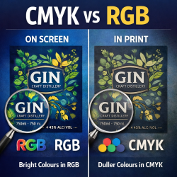
RGB is the colour system used for digital screens, such as phones, computers, and televisions.
Characteristics of RGB:
- Designed for digital display
- Produces very bright and vibrant colours
- Used for websites, social media, and digital graphics
However, RGB colours cannot be printed accurately, because printing uses ink rather than light.
CMYK (Cyan, Magenta, Yellow, Black)
CMYK is the standard colour system used in commercial printing.
Characteristics of CMYK:
- Designed specifically for printing presses
- Uses four ink colours to create all other colours
- Produces reliable and predictable print results
Why It Matters
If artwork is created in RGB and sent for printing, colours will automatically be converted to CMYK.
This can cause:
- Duller colours
- Unexpected colour shifts
- Brand colours not matching your expectations
Best practice: Always design label artwork in CMYK from the start.
What is Bleed and Why is it Important?
When labels are printed, they are produced on larger sheets or rolls and then cut to their final size.
A bleed is an extra margin of artwork that extends beyond the trim line.
Why Bleed is Necessary
Even with precise cutting machines, there can be tiny variations during trimming. Without bleed, this can result in thin white edges appearing on your label.
By extending background colours or images beyond the edge of the design, bleed ensures the final label prints cleanly with no unwanted borders.
Typical Bleed Guidelines
For most labels:
- Bleed: 2–3 mm beyond the trim edge
- Safe area: Keep important text at least 2–3 mm inside the edge
This ensures logos, text, and critical elements are never accidentally trimmed.

Understanding High Resolution
Resolution determines how sharp and clear your images appear when printed.
Resolution is measured in DPI (dots per inch).
Recommended Resolution for Labels
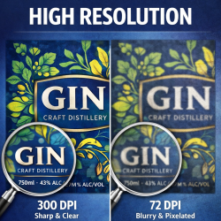
- 300 DPI at actual print size is the industry standard for professional printing.
Problems with Low Resolution
Images downloaded from websites or social media are often 72 DPI, which is suitable for screens but not printing.
Low-resolution artwork can result in:
- Blurry images
- Pixelated logos
- Poor print quality
If an image looks slightly blurry on screen, it will likely appear much worse once printed.
Why Vector Files are Ideal for Logos and Graphics
Vector files are one of the best formats for printing labels.
Unlike standard images, vectors are created using mathematical paths rather than pixels, which means they can be scaled infinitely without losing quality.
Benefits of Vector Artwork
Vector files allow:
- Perfectly sharp logos
- Scalable graphics
- Clean text edges
- Smaller file sizes
- Accurate reproduction on any label size
Common Vector Formats
Preferred vector formats include:
- AI (Adobe Illustrator)
- EPS
- PDF (vector format)
Whenever possible, logos should always be supplied as vector files.
How to Submit Artwork for the Best Results
To ensure a smooth production process, it is recommended that artwork be submitted in the following way:
- Print-ready PDF file with bleed included
- Editable source file (AI or EPS)
- Linked images or embedded graphics
- Vector logo files if available
- Clear indication of final label size
- Special finishes noted, such as:
- Foiling
- Embossing
- Spot UV
- White ink
Providing complete artwork files helps printers verify the design quickly and move your labels into production faster.
In Conclusion
Preparing artwork correctly is one of the most important steps in producing high-quality labels. Understanding concepts such as CMYK colour mode, bleed, high resolution, and vector graphics ensures your labels print exactly as intended.
By following proper artwork guidelines, brands can avoid delays, maintain colour accuracy, and achieve professional results that truly represent their products.
A well-prepared design combined with expert printing ensures that your label does more than simply identify your product—it elevates your brand on the shelf.
Need Help Preparing Your Label Artwork?
Our team can assist with artwork setup, adjustments and print-ready preparation to ensure your labels are produced to the highest quality.
Contact Rebsons Labels & Packaging to discuss your next label project.
Send an email to: sales@rebsons.co.za